

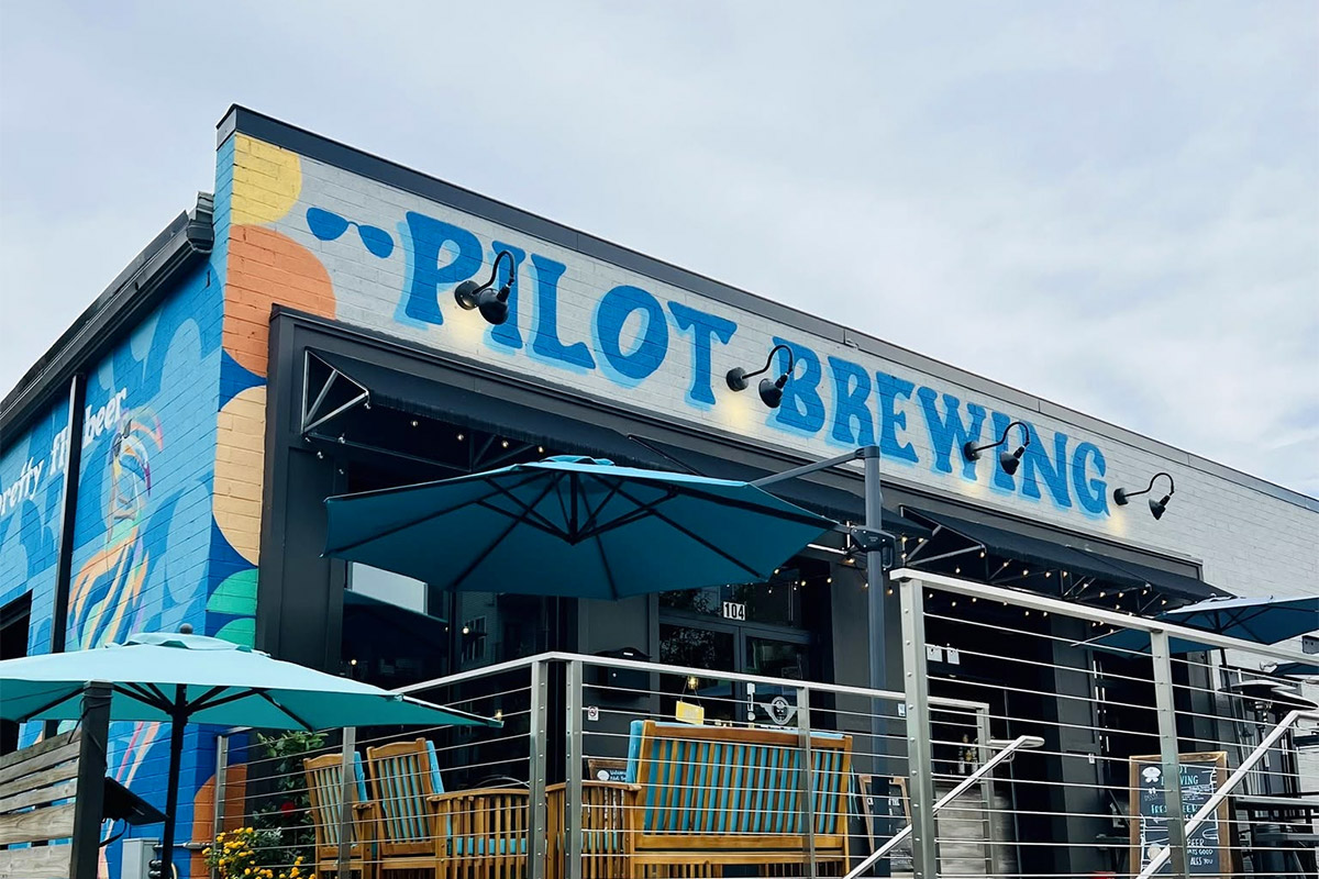

Pilot Brewing sits in a 1,900-square-foot space on Central Avenue in Charlotte’s Plaza Midwood neighborhood, next to Midwood Smokehouse and down the street from Resident Culture. Rachael Hudson opened it in August 2018 with her husband Jeff, a professional pilot, after years of brewing at NoDa Brewing, Hardywood Park in Virginia, and Left Hand in Colorado. The name is a play on aviation, but it’s really about scale. Pilot operates on a three-barrel system with no flagship beers. Everything is small-batch, all rotating, all the time.
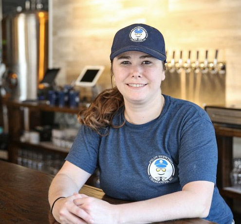
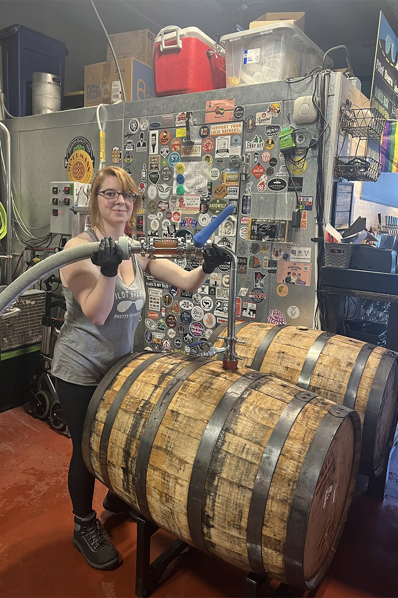
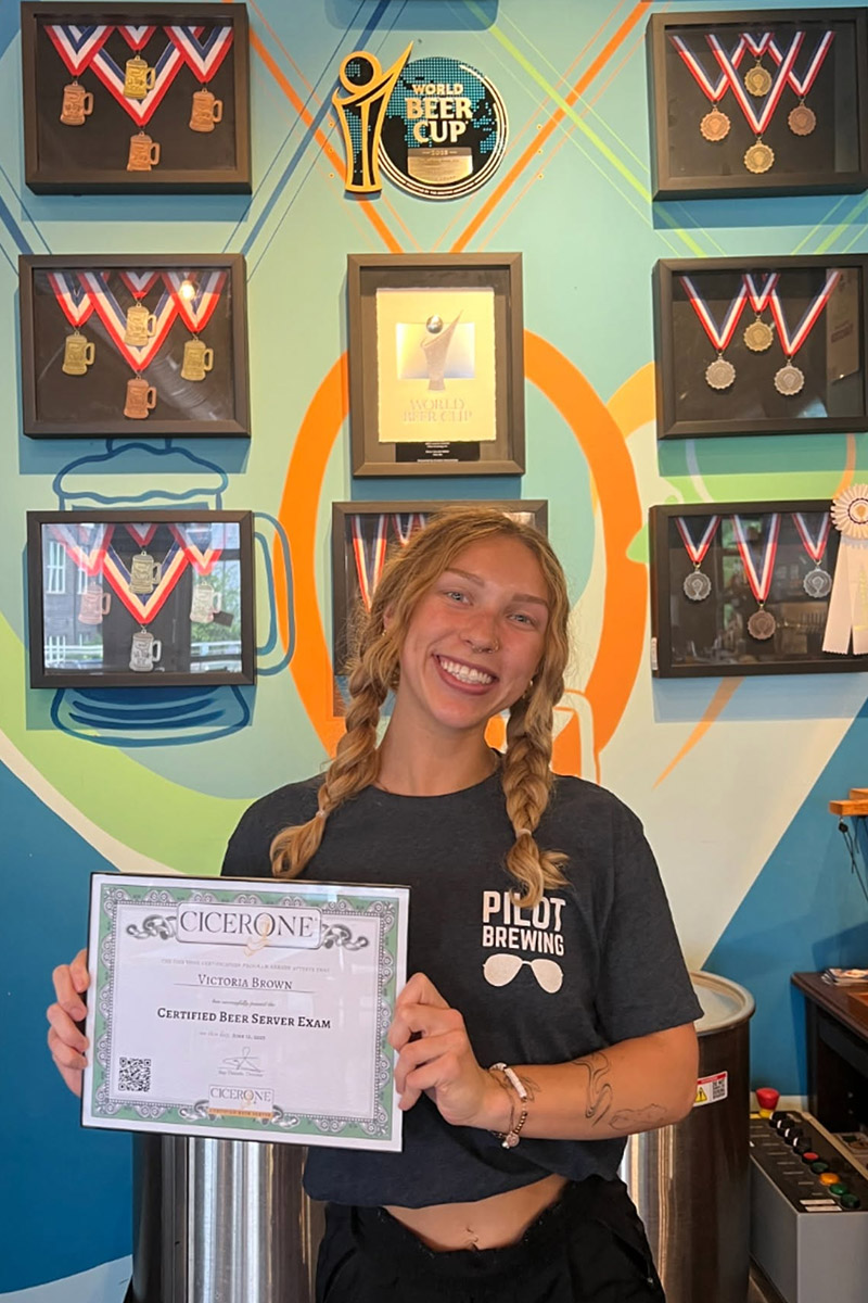
The beer program is where Rachael’s identity as a brewer comes through. There’s a half-barrel “Co-Pilot” system where staff members create their own recipes that go on tap. She encourages every employee to pursue Cicerone certification and hosts public beer education classes. All of the beer is gluten-reduced. In 2022, Pilot ranked fifth overall in the U.S. Open Beer Championship, bringing home three gold medals and a bronze. For a nano brewery with no flagships, that’s a statement about what consistent experimentation can produce.
But the beer is only part of what Pilot is. Every month, the brewery partners with a different local charity, hosting events and donating a portion of sales from a dedicated drink. Walk into Pilot on any given evening and you’ll find regulars who’ve been coming for years sitting next to first-timers who wandered in from the apartment complexes up the street.
This is the kind of brewery that easily sells itself in person. The challenge is translating that to a screen. Social media for breweries has changed significantly in the last few years, and what used to work, posting a beer photo and letting the product speak for itself, doesn’t move people the way it once did. The platforms reward different things now because the user’s preferences have changed, and keeping up with those shifts while also running content for a business is genuinely difficult.
Even when a brewery has someone dedicated to social media, figuring out the right strategy, knowing which content to prioritize, how to balance promotion with storytelling, how to make the feed feel like the brand, that’s a different skill set than just showing up consistently. And it’s one of the hardest things to develop from the inside, because when you’re close to the brand every day, it can be hard to see what’s missing from the outside looking in.
When I audited Pilot’s Instagram, that’s what I found. Not a lack of effort, but a gap between who they are and what they’re showing. Their brand identity is there, but the content isn’t telling that story yet.
The Bio: Selling a Feeling, Not Just Features
The first thing I look at on any brewery’s Instagram is the bio. You have 150 characters to answer two questions: who is this place for, and what should I expect when I walk in?
Pilot Brewing’s bio reads: “Woman-owned. Award-winning. Plaza Midwood, Charlotte, NC. Rotating taps. Events. Good company. Host your events in our taproom.”
The identity signal is there but it’s surface-level. “Woman-owned” and “Award-winning” tell you something, but they don’t do enough to help people determine if this place is for them. The experience signal could also use some work. “Rotating taps, Events, Good company” could apply to many breweries.
This is really common. Most breweries write their bio as a list of features rather than a feeling. They’re trying to fit everything in, so they default to bullet points and broad descriptors. The problem is that a bio built from features doesn’t create any emotional pull.
The way I think about a bio is in layers. Your first line should tell someone who this place is for. Your second line should tell them what to expect. And if you have room, a call to action. For Pilot, that could look something like leading with the nano brewery identity and the community angle, then mentioning the things that actually make the experience different, like staff-created beers or monthly charity partnerships. That’s the kind of bio that makes someone stop scrolling and think “I need to go here.”
This could look like:
Your cozy Plaza Midwood craft hangout.
Woman-owned, award-winning & staff-crafted small batches
Stop in for a flight this week.
Your cozy Plaza Midwood neighborhood craft hangout.
Woman-owned & award-winning with monthly charity pours.
See what’s on tap.
I’d also recommend adding “Charlotte, NC” to the name field for searchability. Right now, someone searching “Charlotte brewery” on Instagram won’t find Pilot through the name field alone.
Another area I would recommend updating is the link area. One of the biggest conversion killers uncovered in this audit is the “double-menu” setup. Currently, the account is using both Instagram’s native multi-link feature and a Linktree, which inadvertently hides their own content. By forcing users to click through a menu just to get to another menu, you introduce unnecessary friction and guarantee a steep drop-off in traffic.
If they do make it to the other menu, the user is faced with choice overload. Listing every single trivia night, watch party, and class as its own individual link creates a massive wall of text. Studies show that when users are faced with too many options, decision fatigue sets in—they get overwhelmed and simply leave rather than hunting for what they want.
The goal of a link-in-bio is to get users off the app and into your ecosystem with as little friction as possible. To streamline the user journey, I would remove the native Instagram multi-links and rely on a single, clean menu of 4 to 5 core options—like “Upcoming Events & Tickets”—that drives visitors to a centralized events landing page on your website. This makes the information easier for the user to digest and cuts down on weekly link-updating chores for their team.
The Highlights: Answering Questions Before They’re Asked
Highlights are one of the most underused tools on Instagram. They sit right below the bio and they’re the first thing a new visitor taps when they want to learn more about you. I think of them as a mini website for your brand. They should answer the questions people have before they visit.
Pilot has a solid set of highlights with branded icon covers, which is a nice visual touch. The categories are: Beer Edu, Events, Weekly Events, Charities, Pilot Pets, Releases, and #BTS.
The charities highlight is a standout. It aligns perfectly with Pilot’s core values and it’s the kind of content that makes someone feel something about the brand. Pilot Pets is fun and on-brand for a dog-friendly space.
Where there’s room to improve is in the structure. “Events” and “Weekly Events” are doing the same job. I’d recommend consolidating those into one highlight and keeping it updated with the most current information. “#BTS” is an abbreviation that might not land with a new visitor who doesn’t know what it stands for. I’d rename it to something more intuitive.
The bigger miss is that there’s no “About Us” or founder story highlight. For a brewery with as much personality and community involvement as Pilot, that’s a missed opportunity. A new visitor should be able to tap one highlight and immediately understand who this place is. There’s also no food or menu highlight, even though Pilot brings in food vendors regularly.
The general framework I use for highlights is this: if someone lands on your profile and only looks at your highlights, could they answer these questions? What kind of place is this? What can I eat and drink? What’s happening this week? What makes this place different? If your highlights can answer all four, they’re doing their job.
The Feed: Showing the People Behind the Pint
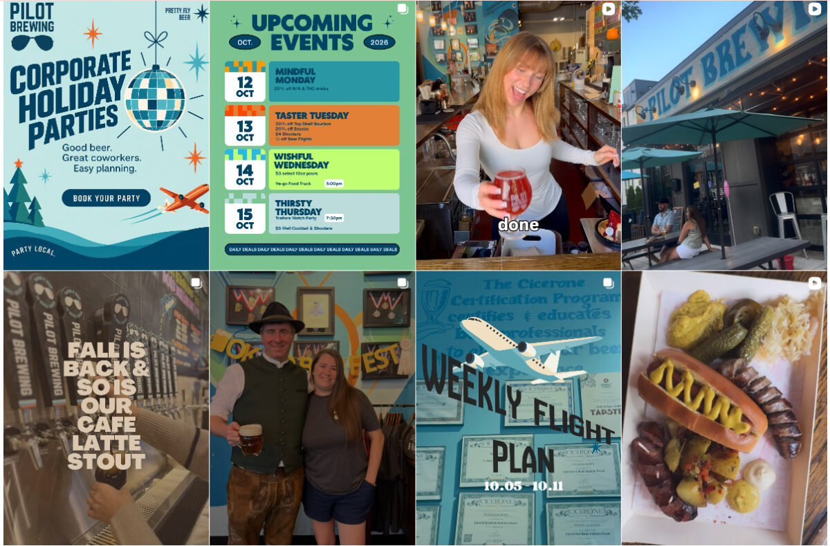
The grid is where everything comes together visually. Scrolling through Pilot’s profile, you will notice flyers throughout their feed, which is usually the first place my eyes go. Another thing I like to focus on is colors and font choice. Pilot does a great job of templatizing a majority of their flyers and reusing colors to make their feed cohesive. However, on their Reels, different fonts are being used when I would suggest sticking to one style throughout. While having an aesthetic grid is no longer a priority for Instagram, streamlining font choice helps to further define your brand and eliminate making another decision about social.
The non-graphic content doesn’t have a consistent editing treatment either. Some are warm and well-lit, some are dark and candid. This isn’t unusual for a small brewery, but it means the grid doesn’t feel intentional.
This happens because small teams are creating content on the fly. They’re not thinking about how a post looks next to the one before it because they’re just trying to get something up.
Again, we don’t need the perfect Instagram grid. But making small tweaks like picking a consistent editing style for photos and finding ways to reduce the dependence on flyers. When someone scrolls your feed, every third or fourth post should be something that tells them who you are, not just what’s happening this week.
The Reels: Showing Your Brand, Not Just Trends
It was great seeing the number of Reels Pilot is posting, which is more than I typically see from a brewery this size. This puts them ahead of the game since they’re already comfortable creating video content.
Where there’s room to grow is in what those Reels are about. They tend to lean into trendy Reel content instead of content that focuses on the brand. Trends aren’t bad, and they can help with reach, but when the majority of your video content is built around what someone else started, it doesn’t tell anyone who your brewery is. A viewer might watch, maybe even engage, but they’re not leaving that Reel thinking “I need to go to Pilot Brewing.”
This is a pattern I see a lot. Breweries see a trend and think “we should do that,” and they’re not wrong, but if that’s the primary content strategy, the feed ends up feeling like a collection of trends rather than a window into who this place actually is.
The opportunity is to take that same energy and consistency and point it toward content that’s theirs. I recommend they start posting content that shows a staff member talking about the co-pilot beer they created. They could create a 10-second Reel that shows us what the taproom looks like on a busy night. Or tell the story behind this month’s charity partner. That’s the kind of video that makes someone want to visit.
The broader content issue is the balance between event promotion and brand storytelling. Pilot’s feed is heavily weighted toward event graphics. If I were building a content strategy for this account, I’d organize it around three pillars: who you are, what you offer, and reasons to visit. For Pilot, “who you are” is the charity work, the co-pilot program, the staff, and Rachael’s story. “What you offer” is the beer itself, the education, the gluten-reduced lineup. “Reasons to visit” is the vibe, the food vendors, the events, the dog-friendly patio. Most of that lives in the first two pillars right now, but the feed is almost entirely the third. I would recommend rebalancing their feed to focus on the other two pillars.
The Final Step: Turning Curiosity Into Connection
Pilot has everything it needs to be compelling online. The community, the differentiators, the events, the people. The gap isn’t in what they’re doing at the brewery. It’s in what they’re showing on Instagram.
At its core, social media is a tool for connection. It’s how strangers become curious, how curious people become visitors, and how visitors become regulars. That connection doesn’t happen through event flyers or trending Reels. It happens when someone sees a piece of content and thinks, “That place feels like it’s for me.” Pilot already creates that feeling in person, every single day. The work now is giving the content the same job.
That doesn’t mean overhauling everything overnight. It means starting to tell more of the story that’s already there. Featuring the co-pilot beers. Showing the charity partnerships. Letting the staff’s personalities come through. Giving Rachael’s journey as a founder some space on the feed. They have a clear identity, now it’s just about getting it to show up on their feed.


 Resource Hub